Increasing utilization with a best-in-class API documentation experience
1 month
2 people
Developer tools
Empowering developers with best-in-class tooling.
T-Mobile’s DevEdge approached us looking to provide a more competitive developer experience to their API users. They had received feedback through their support channels that the existing developer experience was confusing and made their powerful API offerings difficult to leverage. They were preparing for the upcoming Mobile World Congress in 2024 and wanted to debut DevEdge with a five-star developer experience.
01
Problem Statement
Developers were burning time experimenting and testing DevEdge’s API offerings within their test environments. The time it took to digest documentation, code, and deploy in their environments slowed the process of learning the services enough to leverage them in their products.
02
Solution
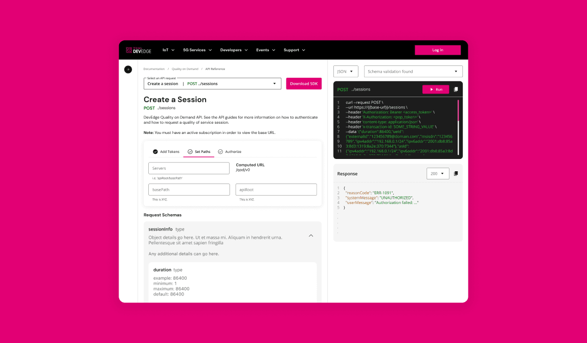
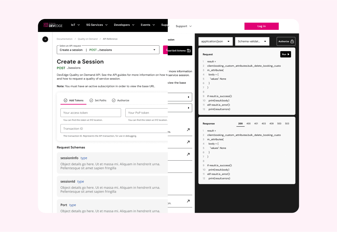
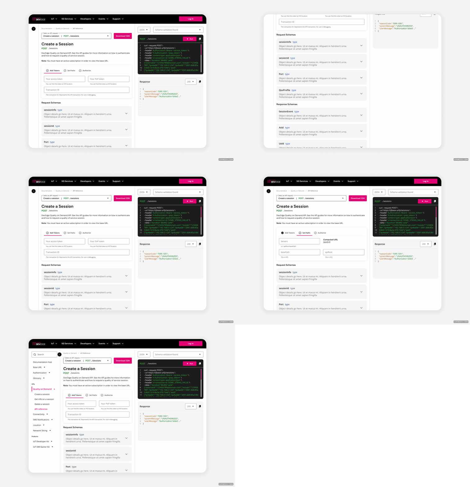
Our new API reference page is a safe playground for developers. It allows them to learn and test code within DevEdge’s developer portal, without the risk of affecting their own environments. They can plug-in their own API keys to understand how code will perform, without any impact on their existing code base. This speeds up the development process and allows developers to experiment without the risk of affecting their existing code base.
03
About the client
Born from T-Mobile’s innovation center, DevEdge is a developer platform that democratizes access to the network, making it fast, easy, and simple for any developer to create connected solutions. In 2022, DevEdge launched its first iteration of the developer portal, targeted towards users who purchased their launch product, the IoT Dev Kit.
04
Research & Ideation
Balancing demand and value
Everyone on the team went into this project with limited industry experience, unclear problem definitions, no defined project requirements, and many questions. Although ambiguity can cause time delays, it is often the starting point for the best solutions. As a team, we were prepared to cut through the unknown with research and curiosity.
Aligning everyone around a vision
During our stakeholder interviews, we discovered small discrepancies in the team's individual goals and the project's expectations. To ensure everyone was on the same page, we hosted an immersion workshop. This collaborative effort allowed us to align the team on the project's needs, wants, and wishes, and validate our assumptions with all relevant individuals present.
Mapping out the landscape
DevEdge doesn't exist in a vacuum. There are dozens of incredibly successful API developer solutions on the market. While not all may offer the same services DevEdge provides, they still give a good example of what to do or what not to do. We performed market research to understand what a "best-in-class" developer experience looks like in today's market.
Here are some of the observations we noticed that helped inform our choice to prioritize designing an API Reference page:
Interactive and Live Documentation
Interactive examples within documentation, such as live code sandboxes or API testing tools, are becoming more prevalent. These allow developers to experiment and see the results of API calls in real time, enhancing learning and experimentation.
Personalization
Tailoring documentation to the user's specific needs, preferences, or previous interactions can make learning more efficient. This might involve personalized recommendations or customizable documentation views.
05
Users as the compass
Before defining what the project should focus on, we needed to weigh in with our users. We performed moderated interviews with users from each of our target user groups. The insights from these interviews, combined with our market research and understanding of business objectives, are what ultimately had us drilled down on interactive tooling.
We heard time and time again that users would decide which API to use (should multiple options be available) based on what documentation and tooling were available. We found that users consistently called out interactive tooling, like an interactive API reference page, as what separates a good developer experience from a great one.
"Something that Stripe has done well is without having to set anything up, they offer you dev mode keys and then live keys. Their documentation is almost like a sandbox where you have these code snippets, and you can kind of run them and see answers. That can be useful too if it’s functional."
"A sandbox is vital. I want a sandbox every time."
"Don’t put fake test data in the sandbox. I don’t want to validate your test, I want to run my own data."
06
Ideate & Validate
Time to go to the drawing board
Armed with synthesized research and clear priorities, it was time to jump into solutions. Jobs to be done are central to my framework of ideation. I connected our core users' jobs to be done with how might we questions, combined with the current state and capabilities of the API Reference page, to arrive at the solution we landed on.
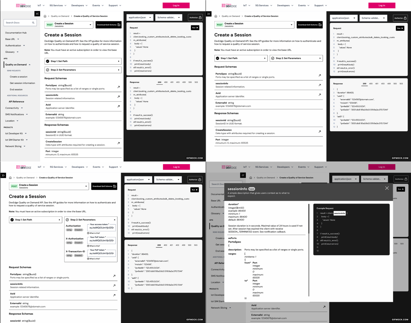
Wireframes
This design blended DevEdge's current-state features and added core elements that would help users perform their jobs more efficiently and effectively.
Testing
During testing, we discovered that this design was a significant enhancement over the existing API reference page, particularly in providing clear sandbox testing tools. While our initial rounds of testing revealed limited friction points, we were able to identify a few areas for improvement to further enhance the user experience.
07
DESIGN & VALIDATE
Bringing the vision to life
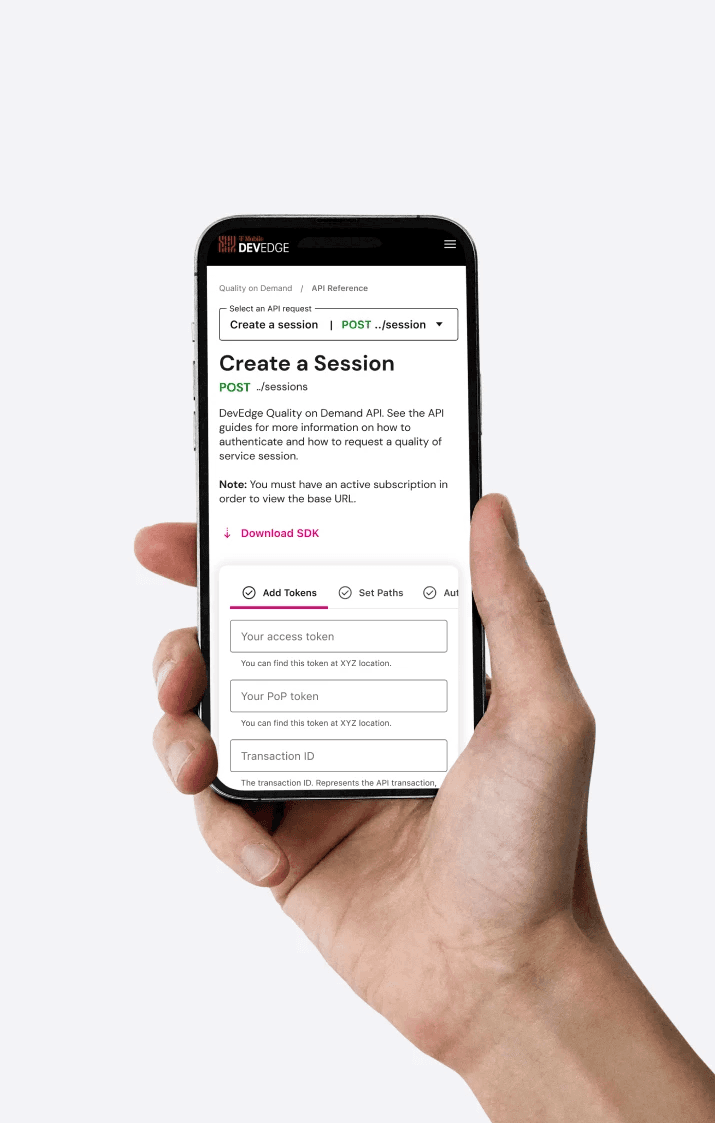
After testing, I turned the API Reference page into a high-fidelity reality ready to be validated and handed off to development. I made the tweaks that I identified in our initial round of usability testing and prepared for one more round of validation.
High-fidelity prototypes
Using Figma, I converted the wireframes to a high-fidelity prototype. I took into consideration the feedback and observations we received in our previous testing phases and made the following adjustments to the experience:
Users indicated the ability to select from multiple languages when testing code was critical. In response, I added a language selection dropdown to support this need.
During usability testing, I observed that some users had difficulty finding the additional input fields within the accordions. I created an alternate widget that exposes input fields depending on which step the user has selected. This draws the user's eye to the input fields and leads them through each step required to customize the sandbox environment.
Users indicated that having the different response codes to click through was very useful. However, there was some friction in using the tab functionality. To remedy this, I switched the tabs to a dropdown.
Usability testing
We didn't have the resources to recruit users for an additional round of usability testing. Thankfully, Method had its fair share of API developers. So, we employed guerrilla testing methodologies and tested them with our team members.
08
overline
Supporting developer independence
While the site was not scheduled to go live during our time on the project, we could still see how users reacted positively. The data we collected indicated that T-Mobile's DevEdge team could anticipate a reduction in support requests related to their APIs that have sandbox tooling available.
Our Wins
We received qualitative feedback from real users that this experience provided the resources they expected from a best-in-class experience.
We anticipate that there will be a reduction of support requests due to:
Increased navigability
Consolidation of relevant information
Ability to test and debug from the developer portal
Challenges
Despite having limited resources and a small team, we got creative in our approach to user research and usability testing. We demonstrated agility by using our team members as users for more guerilla-style research, overcoming the constraints effectively.
Mid-project, T-Mobile introduced a new design system for all its digital products. This required us to pivot our design and ensure compliance with the new standards. We saw this as an opportunity to connect with T-Mobile's design teams working on similar projects. This collaboration opened up channels of communication, ensuring a more seamless and unified approach to our work.
