Increasing onboarding completion rate with delightful UI and simple UX
1 month
2 people
Finance, insurance
Designing an onboarding process for Upwise — a financial wellness application by MetLife.
MetLife approached Method looking for a partner who could transform their financial wellness application from okay to amazing. They had just released an MVP and found that they weren't getting the traction they were looking for. Our team partnered with them to provide product strategy and design to deliver an experience that would engage users and guide them along their journey to financial health.
01
Problem Statement
Users were overwhelmed by Upwise's onboarding process and dropped off before they could get into the app. We were asking too much from users before delivering value.
02
Solution
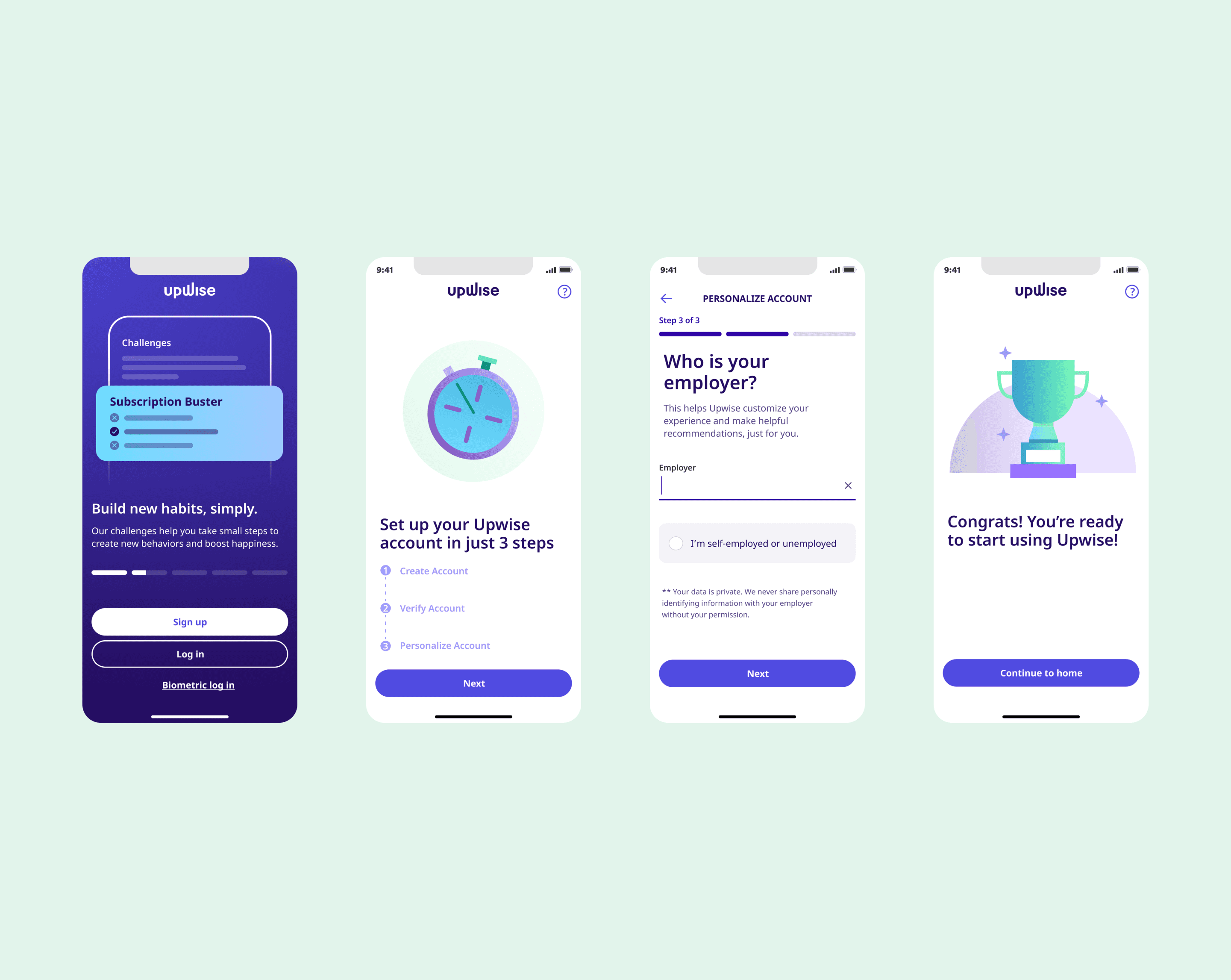
We split the 23 step onboarding process into account sign-up onboarding and in-app onboarding. We reduced the total number of steps to reach homepage to 13. We also incorporate engaging interactions and illustrations to keep the user engaged throughout the process. This resulted in a 73% registration completion rate — 23% above our target!
03
About the client
Upwise is a financial wellness application that provides users with financial monitoring, insights, goal setting, and education. It isn't just another financial management application. Its goal is to provide financial management services that consider the emotional well-being of its users and make financial management feel less daunting and more exciting.
04
Research & Ideation
Balancing demand and value
Going into this project, we had historical data indicating that users dropped off before completing onboarding. We needed to figure out how to get users to provide us with enough information to personalize their experience without asking for too much upfront. We also had to balance users’ caution when providing financial details like connecting their bank accounts. We found we were asking a lot from users before delivering actual value.
User’s have to take how many steps to get to the home page?! (Spoiler: a lot)
To understand how to help users complete onboarding, we needed to know why they weren’t. To do this, I mapped out the current user journey from app download to utilizing core features.
After mapping it out, I discovered users had to take 23 steps before seeing the home screen. While I couldn't say with certainty that that was the only reason users were dropping off, I could at least assume that it was a significant contributing factor.
Our users had a lot to say
When asked and observed, users gave us an incredible wealth of feedback that informed the adjustments made to the onboarding experience. For example, users across the board expressed confusion as to why they were being asked about their emotional state regarding their finances. It is a relatively invasive question, and without a clear explanation of how that data will be used, users were hesitant and unsure.
05
Asking less, delivering more
A good place to start was figuring out how to ask for less while delivering more value. To do this, I broke onboarding up into two categories.
Account creation onboarding
During the account creation phase, onboarding focuses on gathering only the information necessary to get the user into the app and opening up core feature access.
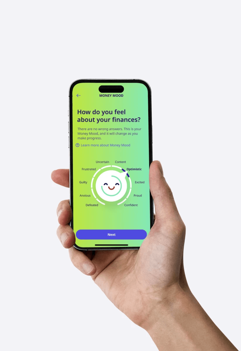
I designed a flow that reduced the number of steps from 23 to 13. Additionally, I emphasized explaining why we were asking specific questions to help the user understand the value they can receive later in the app.
From users
“When I complete joys & stressors I expect to be reassured that I will get the help I need.”
In-app onboarding
To continue gathering information to deliver the user a highly personalized and tailored experience, we still needed to ask them questions that weren't necessary enough to include in the account creation onboarding.
To encourage users to complete this, we incorporated gamification to encourage users to answer questions and link additional financial institution accounts.
From users
“When I finish onboarding I expect the home page to tell me what I need to do next in order to start helping me in the areas I selected.”
06
Ideate & Validate
Envisioning onboarding 2.0
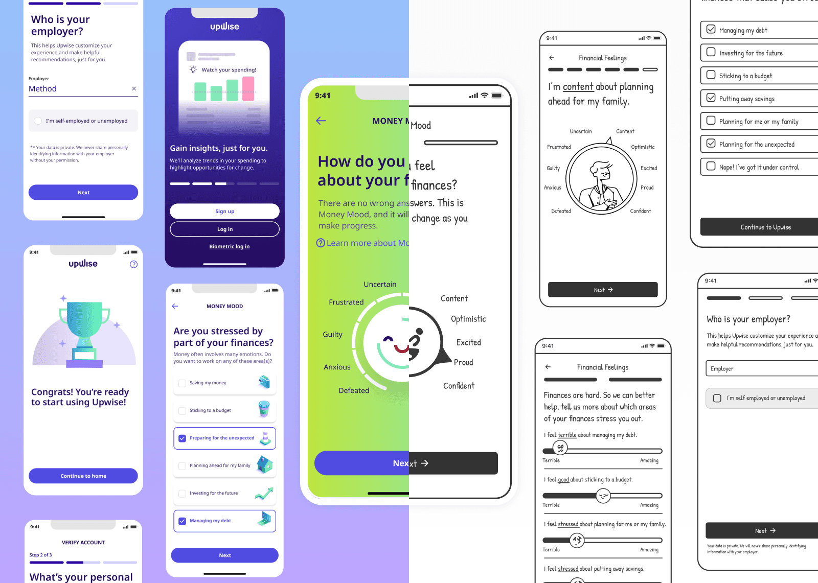
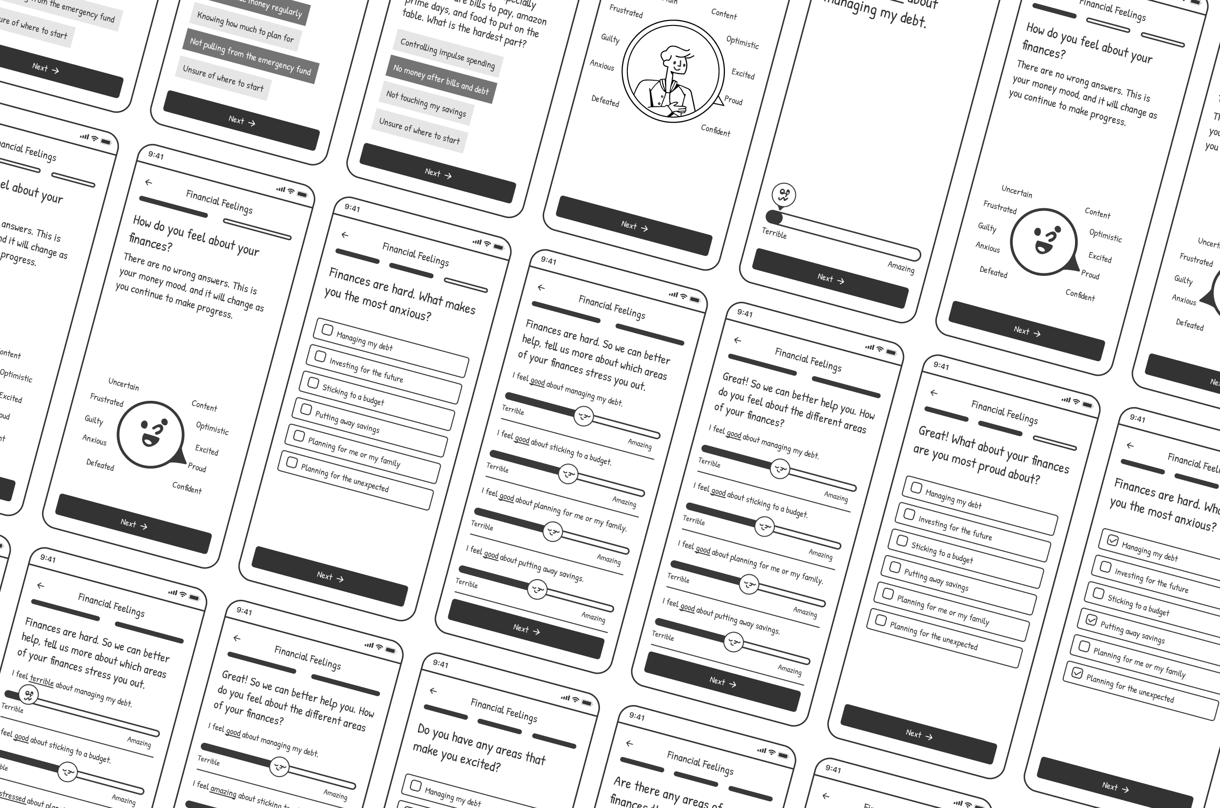
Wireframes
I designed multiple user flows varying in length and questions based on what we heard from users. After many internal discussions with stakeholders regarding how many questions we needed to ask up front, we landed on a flow we wanted to take to the testing round.
Testing
We A/B tested the existing flow (converted to a wireframe) against the new design. We received overwhelming feedback favoring the condensed version. We found that users felt more confident in trusting Upwise with their personal information when we gave clear indicators as to how it would be protected/utilized and when we asked for less all at once.
08
Design & Test
Bringing wireframes to life
After validating our assumptions in the ideation phase, we began working to make the vision a reality. I utilized Figma's prototyping capabilities to imagine what the onboarding experience could be like.
Delivering delight in every touchpoint
To keep users engaged and invested in the application every touch point needs to be delightful — from step one to step twenty three. We decided to use illustrations to connect with users and provide a delightful experience throughout each of the onboarding steps. However, we still weren't sure the best way to represent the Upwise brand visually. To get some answers, we decided to run another A/B test.
People or not?
The primary debate was whether our illustrations should feature people or more of an ambiguous mascot. Ultimately, we decided to go with non-human and object-centric illustrations for the following reasons.
To ensure no one group of people felt singled out as we created illustrations associated with potentially unideal financial circumstances, we didn't want to make anyone in the app interpret it maliciously. To ensure all of our illustrations were inclusive of each user we decided to go with more ambiguous illustrations.
We performed an A/B test against two different illustration styles. We found that while users did not express a strong opinion, preferring one or the other, most leaned towards the more abstract illustration.
We didn't have a dedicated team creating illustrations. We wanted to keep the illustrations as simple as possible to ensure this would scale. We found that choosing object-based and abstract illustrations would be quicker and easier to produce. Additionally, setting up brand standards for this more straightforward approach to illustrations was simpler.
Landing on a final verdict
After bringing the mid-fidelity designs to life and landing on an illustration style, we got the high-fidelity prototype to a final round of testing. There were a few minor feedback points around prototype interactions, but no significant things we needed to iterate on came up. Users completed onboarding and displayed little dissatisfaction with the process or length.
We made some minor interaction adjustments to the knob element of onboarding and then greenlit this design for development. After the development handoff, we eagerly awaited to see it pushed to live in the app.
10
Conclusion
The proof is in the kpis
The only way to know whether or not something worked is to hold your breath, listen, observe, and see the results for yourself. That's precisely what we did. We waited for 2-4 weeks watching the data come in. We saw what we were waiting for: a measurable improvement in our key performance indicators.
Our Wins
We exceeded our target registration completion by 23%. After making these improvements to the onboarding flow, 73% of users were fully completing onboarding.
We aimed to have at least 30% of users link their bank accounts during sign-up. We didn't just meet this target; we exceeded it, reaching 34%.
After splitting onboarding into two parts, we found that 90% of users completed both steps.


